According to a recent study by Statista, 52.5% of all website traffic around the world generates from mobile phones. The research shows mobile web traffic has nearly doubled since 2014 and continues to grow steadily every year. The growing number of mobile web visitors create a strong demand for responsive web design and corresponding plugins.
Here are the top five responsive web design WordPress plugins:
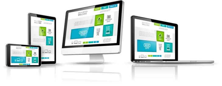
The Best Responsive Web Design WordPress Plugins
Any Mobile Theme Switcher
Any Mobile Theme Switcher is appropriately named thanks to its mobile-optimization capabilities. AMTS detects the mobile browser used to open a site and displays the optimal theme according to its settings. This WordPress mobile responsive plugin is among the best for its intuitive design and simplicity.
Its full range of settings allows users to navigate and select the optimal theme for different mobile devices. This plugin detects:
- Android
- Android Tab
- Blackberry
- iPhones
- iPads
- Opera mini
- Palms OS
- Windows mobile
Jetpack
This responsive web design WordPress plugin made our list as one of the best WordPress plugins of 2017. Jetpack is the most simple tool to use and creates mobile-optimized sites in minutes. Once the website is mobile-optimized, visitors choose which view they prefer to browse with or even switch between views.
Mobile Smart
Like many other plugins on this list, Mobile Smart detects which device visitors are using to open your website in the optimal format. The ability to open a mobile browser and give visitors an optimized user experience is revolutionary.
This plugin is known for its mobile tier detection functionality, which allows it to differentiate between touch, smartphones, and tablets. Mobile tier detection allows conditional content inclusion and improved user experience. For example, visitors on a tablet have an easier time accessing your website and viewing sidebars.
WP Mobile Edition
This plugin includes all the necessary tools to help users create responsive sites for mobile visitors. WP Mobile Edition is fully optimized and delivers exceptional performance to visitors. The plugin allows web visitors to switch between desktop and mobile version for full control of their user experience.
WPtouch Mobile
This lightweight plugin allows users to create a mobile responsive website quickly. The mobile site plugin includes a wide range of customization options and settings. This plugin automatically displays a mobile-optimized site to mobile visitors essentially creating an optimized second version of your desktop version.
The WPtouch Mobile plugin is critically acclaimed as a well-coded solution with premier user experience. The intuitive user interface is simple enough for anyone to use, regardless of technical expertise. This is easily the best WordPress mobile plugin for responsive web design.
Create a Responsive Web Design with Mvestor
The importance of mobile optimization is more important every day, and the demand for responsive web design WordPress plugins proves it. Our team is dedicated to designing responsive websites in the digital age. Contact us to learn how our web design maintenance services keep your site safe and up to date.
