Hey there, web design fanatics. Are you ready for another addition to our series of web design basics? If so, prepare yourself as our web designers explain another web design principle and artistic concept for excellent web design. Today, we explain the web design elements of contrast and similarity.
Web Design Principles: Contrast and Similarity
Contrast and similarity are like the yin-yang of web design. One needs the other, and they need to be in the balance for them to work. Too much contrast creates an ugly, incomprehensible website; too much similarity bores the reader. When a talented web designer balances their powers, it can create a website page people can understand and be delighted to look at and engage with.
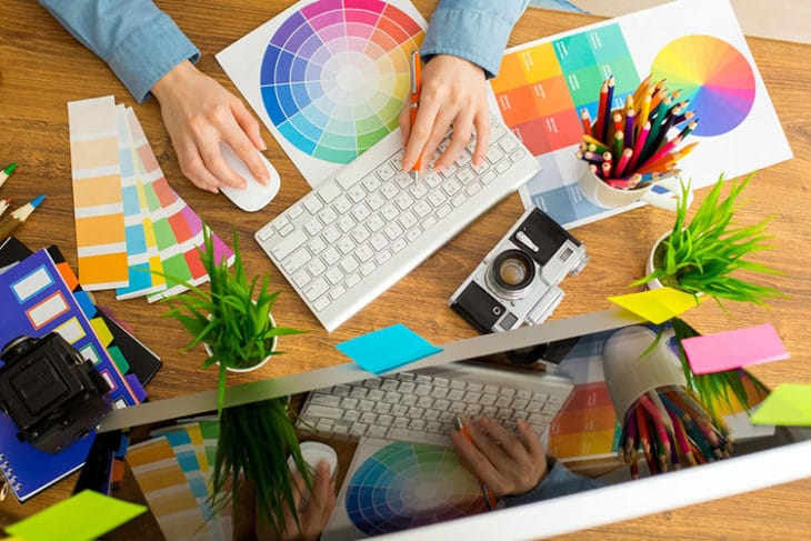
Contrast and similarity encompass a multitude of entities on a webpage. For simplicity sakes, our Las Vegas web design company will use colors as exemplars. If you want to delve deeper into the complexities of website design, consult with our web design experts.
Contrast
Simply put, contrast is the web design principle in how two separate entities differ from another. Contrast is the spicy ingredient that draws attention to itself and gives visual taste to a website page. The best way to use contrast in website design is to be drastic. If you want to make to enclosures on a website page different, don’t use white and off-white. Use black, red, yellow, neon magenta, et cetera. Need to distinguish titles from website copy? Use two different font size and typefaces.
Be careful, however. Some people get eager and contrast too much. That’s what makes websites ugly. Contrast requires a deft implementation and similarity to reign it in.
Similarity
Similarity is the straight-laced, nine-to-five office worker in the field of web design elements. You need similarity to add order and cohesion to a webpage. It is also a quick way to convey that two entities relate to one another. For example, there’s a reason why all of Mvestor’s web pages follow the same color schemes and why copy content follows the same typeface.
Similarity is important, but too much similarity can confuse or bore viewers of your page. This can make people click off your page—or worse. It may end up on lists like this.
The Best Las Vegas Web Design Company
Don’t get out of balance trying to figure out how to make contrast and similarity copacetic. Our Las Vegas web design company have web designers steeped in the ancient tradition of similarity-contrast yin-yang conundrum.
